The color, broken down
Four ways to describe one color. Each slider in the game maps to one of these dimensions.
- HEX
#22E3B9
- RGB
- 34, 227, 185
- HSB
- 167°, 85%, 89%
- HSL
- 167°, 78%, 51%
Nearby tones that look right and are wrong
#22E3D3#22E39F#3DE3BF#07E3B3#1DBF9CHow this color came to be
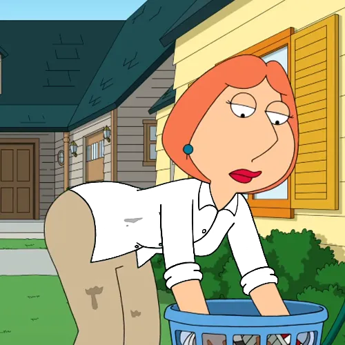
Family Guy premiered on Fox in January 1999, created by Seth MacFarlane after Fox picked up the Family Guy pitch he built on his earlier shorts The Life of Larry (1995) and Larry & Steve (1997). Lois Griffin — voiced by Alex Borstein since the pilot — is the mother of the Griffin family, a piano teacher with red hair and a recognizable green-mint shirt. The shirt has stayed visually identical across more than 400 episodes and nearly three decades on Fox. It's the closest thing Family Guy has to a uniform character color.
The hex breaks down to HSB(167°, 85%, 89%). The hue sits at 167° — past pure cyan (180°) toward green, in the territory designers call "bold mint" or "spearmint." Saturation is high at 85%, brightness very high at 89%. The result is a confident, almost-electric mint that doesn't cross into the cool blue of a swimming pool or the warm yellow of a chartreuse. It's tuned to be both flattering against red hair (Lois's hair) and instantly distinguishable from Brian the dog's white fur or Peter's white shirt at a glance.
Players approach this color two wrong ways. They reach for "teal" (saturation around 60%, brightness around 70%) and land in a deeper, dustier color than Lois actually wears, or they go for "mint" (saturation around 40%, brightness around 90%) and land in a pastel that's far too soft. Lois's shirt is the bolder, saturated version of mint — push saturation past 80% while keeping the hue green-leaning in the 165–170° range. Brightness near 90% finishes it.
How to match it from memory
Calibrated to this character's specific hex, not generic color advice.
- Saturation: ~85% — bolder than typical pastel mint.
- Brightness: ~89% — very high.
- Hue: ~167° — past cyan toward green, in the bold-mint zone.
- Common mistake: reaching for pastel mint (low sat) or dusty teal (low brightness).