Brand Tone — Guess Iconic Brand Colors
Most people swear they know Coca-Cola red. Then they try to dial it in on an HSB slider and miss by 20 points of saturation. Brand Tone is a free 5-round color memory game built around the world's most recognizable brand hues — the reds you've seen a thousand times, the blue you'd recognize across a crowded room, the brown that says "delivery truck" before your brain catches up.
The launch forty
Brand Tone now spans forty globally iconic brands — including gaming names like Xbox, PlayStation, Nintendo Switch, Steam and Razer. Each card is a clean rendering of the brand's most recognizable mark, with the target color sampled pixel-precisely from the image and aligned to the brand's official Pantone or brand-guideline reference where one exists.


Why brand colors are harder than they look
Iconic brand colors live in two places at once: in your visual memory (where they've been polished by repeated exposure into a clean prototype) and in real-world materials (where they shift with lighting, ink, and substrate). Most players are dramatically over-confident on brand colors before they actually try the sliders.
Common misses:
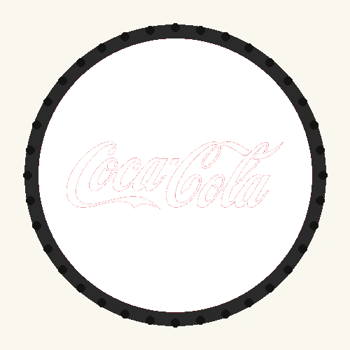
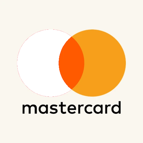
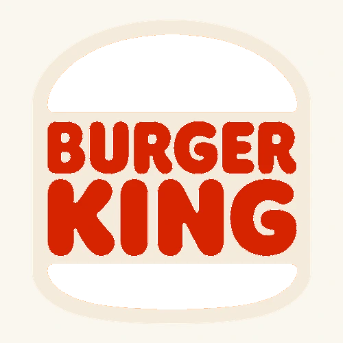
- Coca-Cola red — players often guess a pure
#FF0000. The actual brand red is slightly orange (#F40009): less green, a touch of blue pulled out, very saturated. - Tiffany blue — almost always guessed too cool. The trademarked Pantone 1837 C (
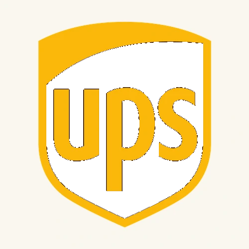
#0ABAB5) is a green-leaning teal, not a sky blue. - UPS Pullman Brown — guessed too warm and too light. The real shade is nearly black with a brown undertone (
#351C15). - McDonald's yellow — surprisingly close to pure yellow, but slightly amber. Pantone 123 C =
#FFC72C. - T-Mobile magenta — guessed too red or too purple. Deutsche Telekom's magenta (
#E20074) sits right between: a vivid pink-red, not violet. - FedEx purple — players guess a more violet hue. The actual Fed-purple is a deeper blue-leaning
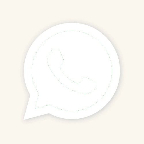
#4D148C— purple with a bias toward navy, not pink. - WhatsApp green — guessed too dark, like Starbucks. The real chat-bubble green (
#25D366) is a bright spring-green, much lighter and more saturated than forest. - YouTube red — this one IS close to pure red (
#FF0000), which surprises people who assume it must have brand-y nuance like Coca-Cola. - Steam navy — players reach for a bright tech-blue. Valve's actual interface navy (
#1B2838) is far darker, almost slate — very low brightness, which is exactly why it's hard to dial in. - Xbox green — usually guessed too bright or lime-like. The real Xbox green (
#107C10) is a deeper forest green: darker and less neon than the version in your memory.
How it works
- You see a cartoon-style card of the brand product (a Coca-Cola can, a Tiffany box, a Hermès parcel, etc.).
- You adjust three sliders — Hue, Saturation, Brightness — to recreate the brand's iconic color from memory.
- You submit; the game reveals the exact target hex and scores your guess from 0 to 10 based on color distance.
- Five rounds total. Average is your final score. There's a hint button if you're truly stuck (costs one point).
About the color accuracy
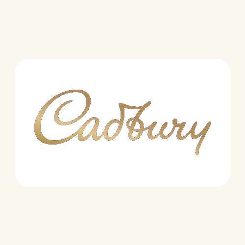
Every card on Brand Tone is generated with the brand color baked in at the pixel level. The target hex stored in our game data is the exact RGB value rendered on the image — no photographic drift, no JPEG noise, no print-vs-screen mismatch. Where a brand has a publicly documented official color (Pantone 484 C for Coca-Cola, Pantone 1837 C for Tiffany, Pantone 2685 C for Cadbury, Pantone 123 C for McDonald's), our chosen hex matches the digital equivalent of that spec.
The brand names and logos used on Brand Tone are trademarks of their respective owners. Brand Tone is a fan-made educational color memory game and is not affiliated with, endorsed by, or sponsored by any of the brands featured.