Color anatomy
The exact scoring color for this Brand Tone card.
- HEX
#00A4EF
- RGB
- 0, 164, 239
- HSB
- 199°, 100%, 94%
- HSL
- 199°, 100%, 47%
Nearby tones to compare against
#0084F0#00C4F0#1DADF0#00A4F0#008BCCWhy this color matters
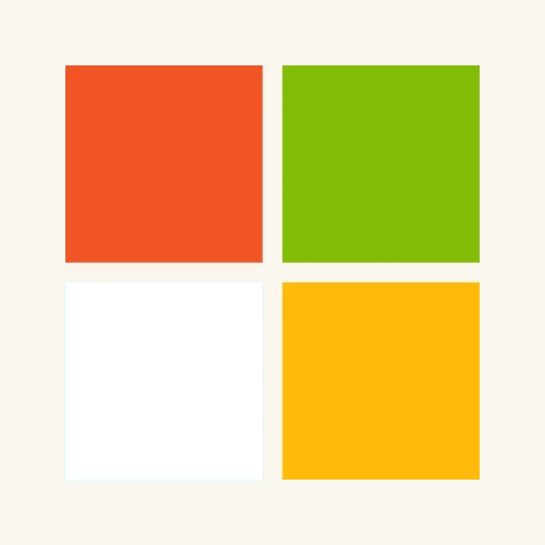
The blue most players hunt is not the colour of the Microsoft wordmark. In the identity unveiled in 2012, the name stays grey; #00A4EF belongs to the lower-left pane of the four-square symbol. That small distinction changes the memory test: recall the colour inside a red-orange, green and yellow grid, not a freestanding corporate-blue rectangle.
A logo for the tile era
Microsoft introduced the identity on 23 August 2012, just before Windows 8, Windows Phone 8, new Xbox services and the next Office release. It was the company's first logo update in 25 years. The wordmark moved to Segoe, the typeface already running through Microsoft products, while the old italic “Pac-Man” wordmark gave way to four level squares built for screens, signs and motion.
The symbol's squares of color are intended to express the company's diverse portfolio of products.
Jeff Hansen, Microsoft Brand Strategy, 23 August 2012
Not a four-product colour key
It is tempting to decode the panes as a rigid legend — blue equals Windows, orange equals Office, green equals Xbox, yellow equals Bing. Microsoft's launch explanation was broader: the squares represented the portfolio as a whole. This is therefore the blue of the corporate symbol, not permission to substitute whichever Windows accent a player remembers.
The exact electric blue
#00A4EF is RGB 0/164/239 and HSB(199°, 100%, 94%). With no red at all, it is fully saturated; its hue sits 19° from cyan toward blue, while its brightness stops just short of the maximum. Players commonly darken it toward a generic software blue or push it all the way into cyan. The target is brighter and more aquatic than LinkedIn blue, yet less violet than Facebook blue.
From three storefronts to a global signature
On launch day, the new mark appeared on Microsoft.com and at exactly three Microsoft stores: Boston, Seattle's University Village and Bellevue. Microsoft warned that the old logo would remain visible during the rollout. That gradual handover explains why several generations of Microsoft blue coexist in memory; this pane belongs specifically to the square-led identity that announced the company's tile era.
Microsoft blue vs its corporate-blue neighbours
#00A4EFMicrosoft symbol pane#1877F2Facebook blue — more violet#0A66C2LinkedIn blue — darker and more violet#003478Ford blue — deep navy territoryQuick facts
- Target
#00A4EF· RGB 0/164/239 · HSB 199°/100%/94% - Positionthe lower-left pane of Microsoft's four-square corporate symbol
- Launch23 August 2012 · the company's first logo update in 25 years
- Nota universal Windows accent or a rigid one-colour-per-product key
- Reads asdigital clarity · motion · a connected product portfolio
Trademark notice
The brand names and logos used in Brand Tone are trademarks of their respective owners. Brand Tone is an independent fan-made color memory game and is not affiliated with, endorsed by, or sponsored by any featured brand.