Color anatomy
The exact scoring color for this Brand Tone card.
- HEX
#FBCE07
- RGB
- 251, 206, 7
- HSB
- 49°, 97%, 98%
- HSL
- 49°, 97%, 51%
Nearby tones to compare against
#FAEE07#FAAD07#FAD325#FACC00#D6B006Why this color matters
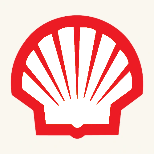
Shell Yellow looks inevitable: a warm field, a red outline, one of the world's most recognisable marks. Yet the first Shell emblem had neither colour nor the shell shape we now picture. It was a black-and-white mussel, and the warmer palette on today's Pecten arrived only in the early 1990s. The colour is not the beginning of the story; it is the result of a century of simplification.
A name from cargo, a mark from a mussel
The name came before the yellow. Marcus Samuel senior imported seashells from the Far East in the late 19th century; when his sons needed a name for kerosene exported to Asia, they chose Shell. Their 1897 import-export company carried it forward. The first shell device, trademarked in 1900, was a monochrome mussel and is now the oldest of more than 22,000 Shell trademarks.
The colour story is less tidy
A neat origin tale would be satisfying, but Shell's current history says the source of red and yellow is uncertain. The colours may echo maritime signalling, fitting a business built on exports. One firmer detail is commercial rather than romantic: Samuel junior used red kerosene cans to stand apart from Standard Oil's blue during their late-19th-century rivalry. Yellow and red became consistent early, but not from one securely documented eureka moment.
Yellow and red have been a fairly consistent element of Shell's brand image from the earliest days although the exact origin is uncertain.
Shell, Our brand history
From black ink to a wordless Pecten
Shell formalised the scallop as the Pecten in 1930 — the company describes the name as Latin for scallop — though local hand-drawn versions still varied. The word Shell entered the emblem in 1948. In 1971, industrial designer Raymond Loewy rebuilt it with geometric curves and moved the name below; by the early 1990s, Shell introduced the current warmer yellow and red to soften the brand's feel and broaden its appeal. The symbol had become strong enough to work without its name.
The exact yellow
The scoring target is #FBCE07 — RGB 251/206/7 and HSB(49°, 97%, 98%). A hue of 49° sits about eleven degrees warmer, toward orange, than pure yellow at 60°; the tiny blue channel keeps it intensely saturated while the red-green gap gives it a golden, almost amber pull. The player trap is to remember only “famous logo yellow” and drift toward a sibling brand. Hold onto the 49° hue: Shell is warmer than Ferrari's lemony shield and far from Snapchat's near-pure yellow, without becoming McDonald's more orange gold.
Shell Yellow vs the logo yellows memory substitutes
#FBCE07Shell Pecten — the target#FCE500Ferrari scudetto — more lemon#FFC72CMcDonald's arches — more orange#FFFC00Snapchat ghost — nearer pure yellowQuick facts
- Target
#FBCE07· RGB 251/206/7 · HSB 49°/97%/98% — the warm Shell Yellow - Originthe Shell name came from Marcus Samuel senior's seashell trade; the first monochrome mussel was trademarked in 1900
- Nota settled colour-origin legend — Shell itself says the source of yellow and red remains uncertain
- Pectenformalised in 1930 · Raymond Loewy's familiar geometry arrived in 1971 · the warmer palette followed in the early 1990s
- Reads aswarmth · visibility · motion · century-scale recognition
Trademark notice
The brand names and logos used in Brand Tone are trademarks of their respective owners. Brand Tone is an independent fan-made color memory game and is not affiliated with, endorsed by, or sponsored by any featured brand.