The color, broken down
Four ways to describe one color. Each slider in the game maps to one of these dimensions.
- HEX
#F18FAF
- RGB
- 241, 143, 175
- HSB
- 340°, 41%, 95%
- HSL
- 340°, 78%, 75%
Nearby tones that look right and are wrong
#F28FA3
#F28FBD
#F2ACC3
#F2729D
#CF7A96
How this color came to be
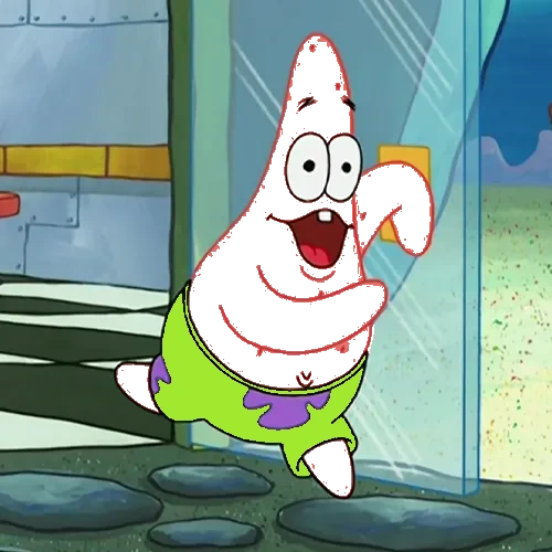
Patrick Star is SpongeBob's best friend, a pink sea star from SpongeBob SquarePants (1999). Where SpongeBob's yellow is calibrated for visual loudness, Patrick's pink is calibrated for warmth: it pairs with SpongeBob's yellow to form one of cartoon television's most recognized two-character color duets. The two characters share screen time constantly, and the yellow-and-pink combination reads cleanly even at thumbnail size.
The hex breaks down to HSB(340°, 41%, 95%). That's a pink with hue sitting just shy of pure red, mid-low saturation, and a high brightness. The color is engineered to be approachable — saturated enough to be a real color, not saturated enough to feel aggressive. The Nickelodeon production team locked this specific pink in 1999, and it has remained consistent through hundreds of episodes.
Players who guess Patrick wrong tend to oversaturate. We see a pink and reach for something hot pink or bubblegum pink. Patrick lives below those, in territory that feels more like "salmon pink" or "Florida pink" — the color of a faded swim trunk or a sunset-tinted starfish. The hue is also further from "pure pink" than instinct says: it lives in the magenta-red range, not in the rose-red range.
How to match it from memory
Calibrated to this character's specific hex, not generic color advice.
- Saturation: ~40% — soft, not vivid.
- Brightness: ~95% — high.
- Hue: ~340° — just under red, not in pure pink territory.
- Common mistake: too saturated, drifting toward hot pink.