The color, broken down
Four ways to describe one color. Each slider in the game maps to one of these dimensions.
- HEX
#A1E82F
- RGB
- 161, 232, 47
- HSB
- 83°, 80%, 91%
- HSL
- 83°, 80%, 55%
Nearby tones that look right and are wrong
#88E82E#BAE82E#ACE84A#96E813#88C427How this color came to be
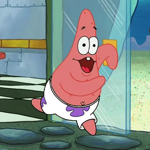
Patrick Star's flower-print shorts carry one of two iconic colors he wears — the pink body skin is the other. The shorts are vivid chartreuse-green with purple flower outlines, and they've been Patrick's standard outfit since the 1999 series premiere. The colour pairing wasn't accidental: the chartreuse sits roughly opposite Patrick's pink body skin on the colour wheel, and that high-contrast pairing keeps the figure reading sharply even in busy underwater scenes. The flower-print pattern itself is a nod to the surfing-and-sea wardrobes the show borrows from Pacific surf culture.
The hex breaks down to HSB(83°, 80%, 91%). The hue sits at 83° — past pure yellow (60°) toward green (120°) but still firmly on the yellow side. This is chartreuse territory: green with a strong yellow lean. Saturation is high at 80%, brightness very high at 91%. The combined effect is a near-neon green that doesn't quite cross into Ben 10's Omnitrix territory at HSB(88°, 91%, 100%) — Patrick's shorts are slightly cooler hue, slightly less saturated, and a touch less bright. Two nearby colors on the spectrum, but the rounds reward different answers.
The single most common wrong answer is "too green" — players reach for pure green at 120° and miss by 37° on hue alone. Patrick's shorts live much closer to yellow. The other miss is on saturation: cartoon greens often go to 100%, but Patrick's is locked at 80%, with that intentional headroom giving the color a slightly more "natural lime" feel. Start at pure yellow, walk the hue 20° toward green, push saturation to 80%, and commit brightness past 90%.
How to match it from memory
Calibrated to this character's specific hex, not generic color advice.
- Hue: ~83° — well past yellow toward green, but still yellow-leaning.
- Saturation: ~80% — high but not maxed.
- Brightness: ~91% — committed near the top.
- Common mistake: reaching for pure green (120°); Patrick lives 37° cooler.