The color, broken down
Four ways to describe one color. Each slider in the game maps to one of these dimensions.
- HEX
#F5B142
- RGB
- 245, 177, 66
- HSB
- 37°, 73%, 96%
- HSL
- 37°, 90%, 61%
Nearby tones that look right and are wrong
#F5C842#F59842#F5BC5F#F5A525#D19738How this color came to be
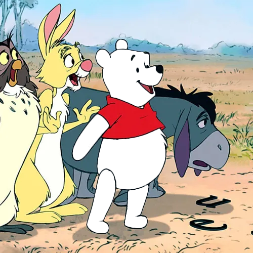
Winnie the Pooh began life as a literary character in A.A. Milne's 1926 book of the same name, illustrated by E.H. Shepard in soft pencil tones that suggested a muted brown-gold. Disney licensed the screen rights from Stephen Slesinger, Inc. in 1961 and produced Winnie the Pooh and the Honey Tree in 1966, the first of the studio's animated Pooh shorts. The New Adventures of Winnie the Pooh aired on ABC's Saturday morning lineup from 1988 to 1991, and it's the version that locked the modern Pooh palette — a warm honey-orange noticeably more saturated than Shepard's original watercolor.
The audited reference is #F5B142, or HSB(37°, 73%, 96%). It is the dominant flat body tone in the current hero image on Disney's official Winnie the Pooh page. Compared with the old answer, the hue is four degrees closer to yellow and the brightness is ten points higher, removing the muddy brown cast that repeatedly surprised players.
Treat the source family as part of the question: book illustrations, plush toys, live-action Pooh, and later digital series are different references. For this round, set hue near 37°, saturation near three quarters, and brightness near the top. Pooh remains warmer and darker than SpongeBob's near-pure yellow, but should read immediately as warm gold, not brown.
How to match it from memory
Calibrated to this character's specific hex, not generic color advice.
- Hue: ~37° — warm gold, clearly on the orange side of pure yellow.
- Saturation: ~73% — strong, but not neon or fully saturated.
- Brightness: ~96% — bright, with only a little headroom.
- Common mistake: reusing the old dark orange-brown reference.